Font Features – An Explanation
Types of Font Features
There are very many font features present in our PCs today all thanks to the graphic designers who tirelessly work to ensure that we have the best fonts. Apart from that, the graphic designers have also developed a wide range of vocabulary that we can use to discuss such fonts.
But the good thing is, you only need to learn just about a few of this fonts and you will be all set in terms of making a decision on the font you will want to use depending on the purpose of your work. Basically, the purpose of the different types of fonts is to put an emphasis on the message you are trying to communicate or giving it an additional meaning.
We are going to look at some of the font features available.
-
Serif fonts
Ideally, we have the serif and the sans serif fonts. It is not clear where the term ‘serif’ was derived from but let’s assume that they are feet or let’s look at them as feet. Therefore from the term ‘sans’ which is a French word to mean without, we can look at the serif and the sans serif fonts as one with feet and the other one without.
An example of a serif font is Georgia;
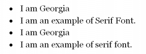
Let’s look briefly at this type of font and highlight some of its features.
When you look at those words clearly, you will notice that there are some little lines at the end of some of the line strokes. Those are now what we term as feet or otherwise the serifs.
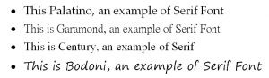
The most common serif fonts are: Times New Roman, Palatino, Garamond, Century and Bodoni.
This is Times, an example of Serif Font
-
Sans-Serif Fonts
As mentioned earlier, san-serifs are the fonts without feet; they don’t have little lines at the end of their strokes. You can tell a font is a sans serif is you don’t see the line like features at the end of their strokes.
For example:
![]()
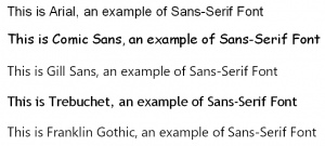
Arial is one of the most common sans serif fonts. If you give the above sentence a clear look, you will notice that it is quite different from the ones above belonging to the serif class. Each line stroke is very clean and you cannot see any additives.
Some of the most popular sans-serif fonts are: Arial, Comic sans, Gill sans, Trebuchet, and Franklin Gothic;
- Decorative Fonts
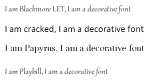
Decorative fonts can also be described as ornamental, script or novelty. These fonts are quite different from the ones we have mentioned above mainly because of the shapes and personalities which are quite unique. Ideally, they are somehow stronger in terms of character and personality compared to the common serif and the sans-serif fonts.
We have quite a number of decorative fonts; let’s look at some of them. The popular ones are Blackmoore LET, Cracked, Papyrus, and Playbill.

Tips on when to use different types of fonts
Based on research, it has been proved that there is a very slight difference of terms of the readability between the serif and sans-serif fonts when it comes to print sources. However, when it comes to virtual or in the electronic context, it has been noted that is a little bit difficult to read serif fonts compared to their counterparts, sans serif.
This, therefore, means that you must consider the following when choosing the fonts to use, your audience, the purpose of your work and the context of use.
For title fonts, consider using sans-serif fonts as they are most suited for heading. By doing so, you will achieve a distinction between your heading and the explanation below it or the content that follows.
However, note that there is no rule of using fonts; actually, it entirely depends on your audience. For example, most of the European countries prefer to have sans-serif fonts when reading a long block of text in a publication.
One common guideline is to ensure that your paper is not mixed with two fonts belonging to the same category, in other words, you should not have a paper with a title in Times New Roman while the content is in Palatino. These two belong to the same category hence they will not auger well. The best thing to do is to have a situation where your title is in sans serif and the content is serif or vice versa. To make this clear, let’s look at examples of these two situations.
Good example: It has a sans-serif heading with a serif body text
Fonts
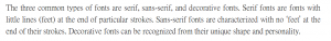
The three common types of fonts are serif, sans-serif, and decorative fonts. Serif fonts are fonts with little lines (feet) at the end of particular strokes. Sans-serif fonts are characterized with no ‘feet’ at the end of their strokes. Decorative fonts can be recognized from their unique shape and personality.
Poor example: Two different kinds of serif fonts in the heading and the body text.
Fonts
It is important to note that there is no official rule on what to do for your heading or the body text, but it is common knowledge that having very many fonts on one page will look awkward and unprofessional. Before settling on a font to use, think about the message you want to pass across and then derive the best way to do so without involving many fonts.
For decorative fonts, the usage should be very limited. Clearly, the unique character and personality in terms of shape make them very unsuitable for extensive reading. Basically, decorative fonts are meant for titles or headers or to add a little bit of emphasis on a small part of the text.
Apart from these, decorative fonts should not be used for the following cases when on the web or when sending an email. Note that all computers will not be able to read your fonts, so this can make it hard for you to pass your message. It is therefore advisable to use the common fonts or setting alternative fonts in the page coding.

The first thing to always think of when it comes to selecting the font for your text is whether you will use serif or sans serif. Basically, starting from a general point of view is important when it comes to narrowing down your search for the best font. In most case, this decision is usually based on the purpose of your work.
Many people consider serif fonts to come with a certain sense of decorations. The serif fonts also come with the advantage of increasing both the reading speed and the readability of long passages.
However, some people protest this by saying that people are good at reading what they are used too. Therefore if one is used to serif fonts, then he/she will not have trouble reading it. That said and done, we have to acknowledge the fact that there are quite a number of sans serif fonts that exist and they provide a better reading experience even at small sizes compared to serif fonts. Before settling on a font, you need to first look at their various characteristics and how they affect their legibility.
The following are some of the important things you need to consider before deciding on either a serif or san serif font.
Purpose
If your work involves lengthy texts, e.g. newspapers, magazines, and books, the most preferred font is serif. This is based on a number of historical perception and their readability. On the other hand, sans serif fonts can be used for small projects such as brochures and annual reports. Apart from these, they can also be used on magazines or any other publication that incorporates design.
San serifs can also be used for shorter text settings such as credits, captions, column headings and texts in graphs and charts. The reason behind this is their simplified letterforms that make them readable even at small point sizes. This can be hard to achieve when using serif fonts.
For example, for books the most preferred font is the Adobe Caslon™ On the other hand, Metro® Nova is the most appropriate choice for a brochure or an annual report.
Audience
The audience is also a very important factor to consider when choosing a font style. For example, if your work is intended for children or anyone who is trying to learn how to read, then sans serifs are the best fonts. This is based on their simple letterforms that make them easy to recognize. This can also be appropriate for people with visual impairments. Be sure to conduct your research before deciding on the font.
For example, a simple sans serif font such as Maiandra GD can work well for children.
Contrast
Contrast is another important thing to look at.
You need to ask yourself whether the font has a high or low contrast. For example, Bodoni font is a high contrast serif font that looks good with high point size but cannot be read in small font.
What we mean by contrast here is the difference between the thick and thin strokes among the various letter forms.
It should be noted that fonts with high contrast are usually not legible as they get smaller since the thinner strokes tend to disappear as small as they get. This means that they can only be used when they are as large as display fonts. On the other hand, fonts with low contrast are very solid and uniform. This makes them look very good when they are used at high point size but don’t provide good results at small point size as they become very blocky.
In terms of personality, fonts with high contrast can be used to show elegance, refinement, and dignity. This can be likened to serif. On the other hand, low contrast fonts are similar to the san serif and they take a solid, powerful and confident personality. Despite the fact that they are almost similar in characteristics, they cannot be used interchangeably. In other words, if you want to achieve the character you want, think of using a low contrast serif or a high contrast san serif. An example of a high contrast font with thin strokes is Didot.
The best font to use in this case is a sturdy serif such as Chaparral™.