What is Font Personality
What is font personality?
Fonts are very important because of their capability to convey attitude, mood, and tone based on the personality that one can perceive from their features. In as much as fonts are commonly categorized based on their typographical features of serifs, it is important to also note that fonts can also be given human-like personalities.
This is to say, how fonts appear, regardless of the words they mention, play an important role in conveying a certain feeling or mood which can either make or break the effectiveness of the message you are passing.
It is therefore very important to be aware of how the font you decide to use will impact the audience you want to reach. This is important because it will help you in gauging how effective your document will be and since you want to achieve 100% you have to be wise in deciding on the font to use.
However, it is important to note that there is no official rule on which font to use under which circumstance e.g. Time New Roman is equaled to a specific mood, but since you have been in a society where fonts have been associated with some personality, the choice of fonts will greatly be based on your instincts and your level of awareness.

Font Personality Types
Let’s now look at some fonts and look at how they can be applied.
-
Garamond
Garamond is a serif font. Being a serif font, Garamond can be a good font for long blocks of text. This is based on its smooth curves. Basically, simple serif fonts are very appropriate as they depict easy going and classic beauty. As such, they can provide a good feeling for someone reading a very long text.
In that case, therefore, Garamond can be the best rhetorical choice when it comes to long blocks of text.
-
Franklin Gothic
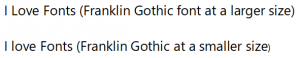
The two sentences above show the font Franklin Gothic at two different sizes, the first one is larger while the second one is smaller. Looking at the font, one can just say it is a straightforward font. This is basically because it has simple features that cannot distract anyone. Apart from that, it is evident that the font can be read both at a large point size and small point size. It, therefore, maintains a high level of readability.
The Franklin Gothic font is one of the most popular fonts since it is the font choice for newspapers. This means that it has the best features for readability. Now the question is why don’t you capitalize on this font for that long text of yours?
-
Decorative fonts
Apart from the serifs and the san serifs fonts, decorative fonts can be used to carry a lot of meaning especially in the context of cultural associations. As mentioned earlier, the meaning of words can be greatly affected by the fonts used on them. This can greatly affect the effectiveness of the message conveyed by those words. This, therefore, means that you should be very cautious when deciding on the font to use. In other words, you need to choose a font that will not hinder you from effectively passing across your message.
To make this clear, let’s look at these two situations:
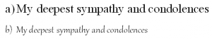
Font (a) is in Monotype Corsiva while (b) is in Bauhaus 93.
If you clearly look at the first example, the one in Monotype Corsiva, you will notice that it has some similarities with handwritten text. It therefore clearly resonates with the message of the card since it reflects heartfelt condolences hence it is effective for the purpose of the card. On the other hand, the font choice for (b) that is the Bauhaus 93, even from the name you will notice that it is a cold font. From its looks, the font appears to be modernist and it is best suited for things like fliers in other words graphic designs.
This is to say that, from its coldness, it is not the appropriate font to be used in a greeting card whose aim is to pass a condolences message. This, therefore, makes it a poor choice for the same. However, this is not to say that the font is not suitable for other areas, it can produce magnificent results in areas where it is best suited, for example:
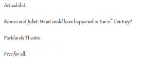
What do you think? Don’t you think it serves its purpose right in this case.
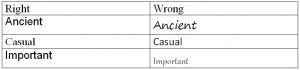
It is important to note that getting the right font personality that matches with the information you want to convey is quite subjective and cannot be considered as a science. However, you can gauge whether you have chosen the right font by matching it with what you think is the opposite of what you are trying to achieve. By seeing how wrong you are in your second choice, you are in a better position to choose the best font personality.
To put this into perspective, the following are font personalities that correctly send their message matched with their exact opposite. Now gauge how effective they are and try to apply the same in your work.
Always ensure that your fonts match the situation you are in.
The following are some questions that you need to ask yourself while choosing a font personality to suit your needs:
-
Serif or Sans Serif
They are quite a number of fonts that belong to the serif and san serif categories each with their own unique character. Deciding whether to use a serif or san serif font is the most paramount decision because it is one of the most notable differences.
This is because of the obvious reasons that serif are mostly considered for a long block of text because they are smooth and provide a good reading experience. Apart from that, the serif fonts also derive their character from their origin. They started being used back in the days of ancient civilization and that is where they get their cultural weight and class.
San serifs are thought of recent innovations as they came into play in the 19th century. Basically, what we are trying to say here is that your choice of serif or a san serif font depends on what you want. Do you want a cool, timeless, clean modernity or a classical authority; you know where to find them.
-
Contrast
You need to ask yourself whether the font has a high or low contrast. For example, Bodoni font is a high contrast serif font that looks good with high point size but cannot be read in small font.
What we mean by contrast here is the difference between the thick and thin strokes among the various letter forms.
It should be noted that fonts with high contrast are usually not legible as they get smaller since the thinner strokes tend to disappear as small as they get. This means that they can only be used when they are as large as display fonts.
On the other hand, fonts with low contrast are very solid and uniform. This makes them look very good when they are used at high point size but don’t provide good results at small point size as they become very blocky.
In terms of personality, fonts with high contrast can be used to show elegance, refinement, and dignity. This can be likened to serif. On the other hand, low contrast fonts are similar to the san serif and they take a solid, powerful and confident personality.
Despite the fact that they are almost similar in characteristics, they cannot be used interchangeably. In other words, if you want to achieve the character you want, think of using a low contrast serif or a high contrast san serif.
-
Diagonal or Vertical Stress
Stresses play a vital role in determining the feeling conveyed in a letter form.
A font stress refers to the angle of contrast occurrence in the letterforms which can either be diagonal or vertical. This can be a little bit confusing.
Before deciding on a font you first need to determine where its stress lies. This can be easily done by studying the orientation of the letter ‘O’. Here you need to look at the bottom left and the top left. If the bottom left is thicker than the top left, then the stress is diagonal which give the font a traditional personality filled with warmth and also very inviting and friendly.
On the other hand, the sides of your ‘O’ are thicker than the bottom and top, then you have a vertical stress. What this means is that your font is characterized by a bold personality, with its modernity and a display of confidence especially when used at large point sizes. However, they can be confused as cold fonts.
-
Vertical parameters
Different fonts have different aspects in terms of their vertical parameters. Have you ever heard someone talking about the x-height of a font?
The x-height of a font coupled with its ascenders’ and descenders’ height can significantly impact the font both in terms of personality and legibility.
Essentially, the ascenders and descenders of a font determine its distinctiveness but also possess a challenge in terms of its readability. Fonts that have tall x-height usually stand out in their character and personality but usually pose challenges in reading.
Fonts with short x-height are the exact opposite. They lose character and personality but are usually the best when it comes to readability.
The question we are now faced with is how to get a perfect balance between the two. To answer this, you need to first have a perfect understanding of the purpose and the audience. Lowercase fonts need to have enough x-height to bring out their personality at the chosen sizes. This is mostly applicable to complex letters such as ‘a’, ‘e’, and‘s’.
-
Counters
Here you need to ask yourself whether the font has open or closed counters. The effect of open counters is to come up with apertures such as in ‘s’ and ‘c’. On the other hand, close contours have the effect of creating bowls such as in ‘b’ and ‘o’. The personality of a font is usually shaped by the curves that depict its contours, the vertical lines of the fonts descenders and ascenders and the areas of the letters that are fully or particularly enclosed for example in ‘a’, ‘p’, ‘b’, and ‘d’.
In this case, you need to have a close look at whether such counters are closed or open. Most of the above examples are usually completely close. However, there are some letters that have variations in different fonts, for example, lowercase ‘g’ can either have two closed contours or one closed and one open.
In the same vein, the lowercase of ‘a’, ‘c’, ‘e’ or ‘s’ may seem to have outer loops that have been tightly hooked hence having closed inside counters. The effect of this can be a distinctive twist that affects the legibility of the font at small sizes. To save the situation here, we can have a larger x-height since it can result in a higher contrast that will define the different parts of the letter distinctively.
In other words, in order to find the best font personality, you need to find a perfect balance of all these five aspects that we have mentioned. Remember that, you can have the best message but an inappropriate font which will result in ineffectiveness.